Wallet Screen Redesign
Jan 23, 2025
Design challenge
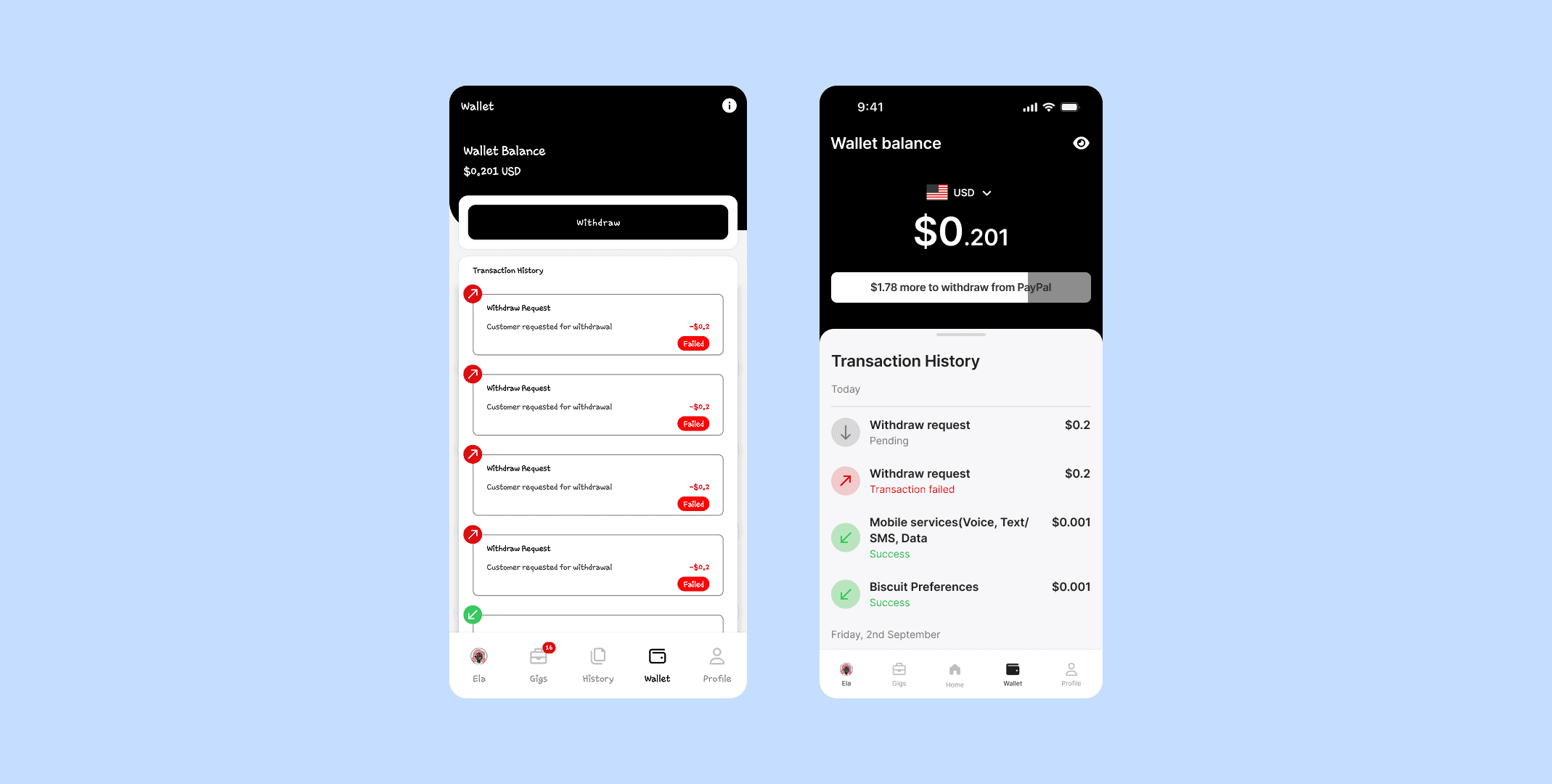
The original wallet screen (left design) caused frequent confusion among users, specifically around:
Misunderstanding their actual wallet balance, often mistaking cents for dollars due to a lack of visual separation between dollars and cents.
Unclear withdrawal requirements, leading users to attempt withdrawals below the provider’s minimum threshold and receiving repeated failures.
A transaction history UI that was visually cluttered, lacked clarity on transaction states, and did not support quick scanning.
These issues led to user frustration, support tickets, and ultimately impacted trust in the platform’s payout system.
How might we’s
Based on user feedback and product goals, we framed the following design questions:
How might we make the wallet balance more readable and less prone to misinterpretation?
How might we clearly show when a user is eligible to withdraw based on provider limits?
How might we help users understand their balance in their local currency for better relatability?
How might we make transaction status and history easier to read at a glance?
Design approach
The redesigned wallet (right design) introduced several targeted solutions:
Visual hierarchy in balance display: We reduced the font size of the cents portion to visually separate it from the dollar amount, addressing the core misreading issue.
Progress bar for withdrawal readiness: A dynamic loading bar now shows how close the user is to reaching the minimum payout threshold, with a clear message like “$X more to withdraw from PayPal.”
Currency conversion toggle: Users can now see their balance in local currency, helping them better relate to their earnings.
Improved transaction history: Transactions are now grouped by date, clearly marked as pending/success/failed with color-coded status and icons, improving scanability and user understanding.
Challenges
One key challenge was maintaining a compact layout while adding more functionality (like the currency converter and progress bar). It also required careful typographic choices to visually distinguish elements without overwhelming the user. Another challenge was making the redesign feel intuitive, especially for users who were already familiar with the older design.
Impact
The redesign significantly reduced user confusion and withdrawal-related support tickets, particularly around misreading balances. Early feedback also showed:
Improved user trust in the payout process
Significant reduction in payout support tickets
Users found the local currency view helpful, especially in regions with low familiarity with USD decimals