Sign Up Page Redesign
Jan 16, 2025
Design challenge
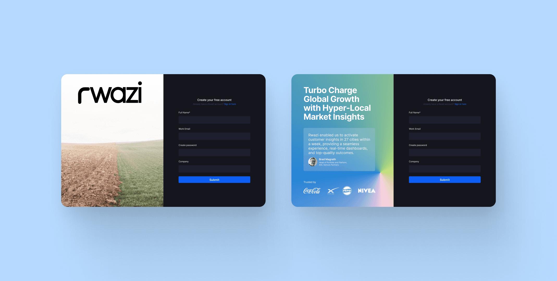
The original Rwazi signup page (left design) presented several usability and conversion issues:
It lacked context and messaging to inform users about what Rwazi does or why they should sign up.
The page was visually unbalanced, with a large background image that overshadowed the form and didn’t contribute to the user’s decision-making process.
There was no social proof or value proposition, which made it harder to build user trust or communicate credibility.
As a result, users arriving on the page had little incentive or understanding to complete the signup process.
How might we’s
To frame the redesign process, I used the following questions:
How might we help users immediately understand what Rwazi offers?
How might we make the signup form feel more trustworthy and relevant?
How might we provide social proof to reduce friction and build confidence?
How might we improve visual hierarchy without overwhelming the user?
How might we make the signup page feel modern, persuasive, and action-driven?
Design approach
I redesigned the signup experience (right design) with a focus on clarity, credibility, and conversion:
Headline and subtext clearly articulate Rwazi’s core benefit: actionable insights from hyper-local markets.
A testimonial from a known customer adds social proof and reassurance.
Trusted brand logos are displayed to reinforce credibility.
A subtle gradient background visually enhances the page and guides attention without overpowering the form.
The form is kept prominent and consistent, but now lives within a context-rich, persuasive layout that better supports user motivation.
Challenges
One major challenge was ensuring that adding more content didn’t overwhelm the interface or push the form out of view. It required careful attention to layout, typography, and spacing to preserve usability while increasing depth. Another challenge was finding a balance between brand storytelling and simplicity, especially for first-time users who may have limited attention spans.
Impact
The redesigned signup page (right design) led to:
Higher user engagement due to the added context and clearer messaging.
Improved conversion rates, as early testing showed users were more likely to complete the form after reading the value proposition.
A scalable layout that can be reused across other marketing and onboarding touchpoints.