Settings Page
Dec 19, 2024
Design challenge
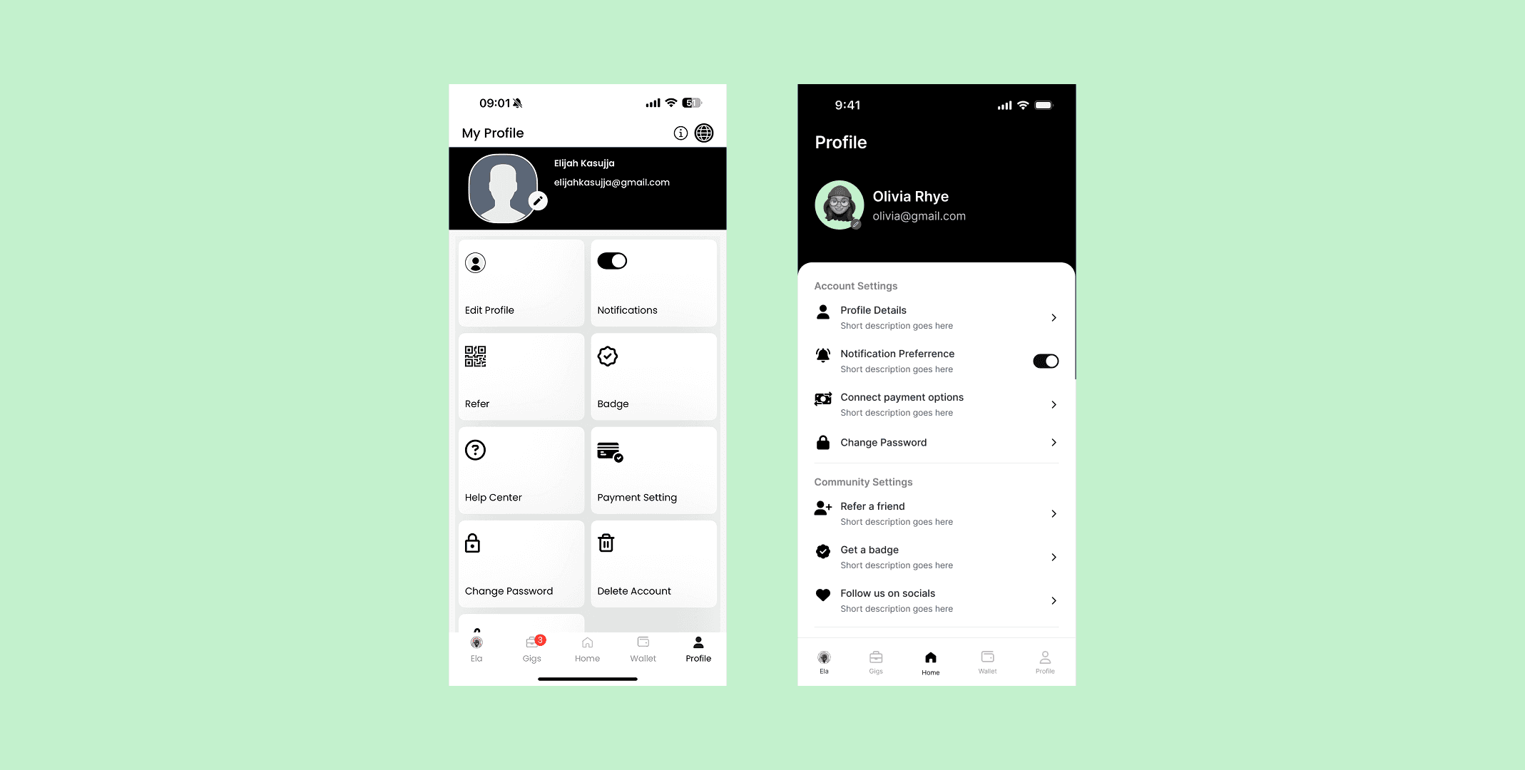
The original profile screen (left design) had several usability and design issues:
Lack of hierarchy and grouping: All options appeared in uniform blocks, making it hard for users to quickly scan and find what they needed.
Poor visual clarity: Iconography and typography lacked cohesion, and some icons were ambiguous or repeated functionality (e.g., "Edit Profile" vs "Change Password").
No context or guidance: Most options lacked supporting descriptions, leading to hesitation or uncertainty about what each action would do.
Cluttered interface: The grid layout with large tiles made the screen feel busy and unintuitive, especially for a settings-related page.
These issues contributed to confusion and a perception of disorganization in the app’s account management experience.
How might we’s
To address these issues and align with product goals, we asked:
How might we create a clearer hierarchy and structure for the settings interface?
How might we make options more scannable and intuitive at a glance?
How might we provide users with more context around each action?
How might we modernize the visual design to feel more professional and consistent?
Design approach
The redesigned profile page (right design) focused on clarity, structure, and modern UI conventions:
Sectioned layout:
Grouped related items to provide immediate structure and reduce cognitive load.
Introduced section titles to guide users through the interface.
List-style navigation:
Shifted from a grid to a vertical list layout, allowing for easier scanning and mobile-friendly interaction patterns.
Descriptions for context:
Added short descriptions under each setting to help users understand the function without needing to tap.
Improved iconography and consistency:
Unified icon style and visual spacing to enhance readability and aesthetic appeal.
Refined text hierarchy using font weights and spacing for better visual flow.Challenges
Challenges
Ensuring that additional descriptions and structure didn’t lead to vertical bloat or overwhelm on smaller screens.
Balancing modern design trends with the app’s existing visual identity and user familiarity.
Designing for scalability: ensuring the layout could accommodate new settings without losing clarity.
Impact
Improved user satisfaction with the settings experience based on usability testing feedback.
Faster task completion for common actions like editing profile details or connecting payment methods.
Reduced support inquiries related to confusion about profile features.
Users reported the layout felt “cleaner,” “more modern,” and “more self-explanatory.”